
When you walk around a school campus, student organizations are usually brimming with energy and pride. Some clubs show off their spirit by sporting distinctive jackets, while others might wear pins or carry customized tote bags. But one element often stands out more than anything else—the patch. Patches are more than just an accessory. They symbolize unity, pride, and identity. However, creating a truly distinctive patch that captures the essence of your organization while standing out from the crowd is no small task.
Imagine you’re at a school fair where dozens of clubs are trying to recruit new members. Each one has a booth filled with students excited to tell you about their mission and activities. But how do you make your organization visually pop amid the crowd? This is where a distinctive patch can make all the difference. A well-designed patch not only serves as a visual emblem for your club but also encapsulates its values, mission, and uniqueness in one small, easily recognizable design.
In this article, we’ll explore how to design patches that are both eye-catching and meaningful, ensuring your club’s identity shines through. Whether you’re starting from scratch or refining an existing design, these strategies will help you create a patch that’s memorable, engaging, and truly representative of your organization.
The Power of Distinctive Patches: More Than Just Fabric
When you think of patches, what comes to mind? Perhaps it’s the pride of a scout wearing their merit badges, or maybe it’s the iconic logos of sports teams displayed on jerseys. But patches in the context of school organizations serve a deeper purpose—they’re symbols of belonging and pride.
A patch can do so much more than identify which group you belong to. It tells a story. Each element of the patch—the colors, the shape, the text, the imagery—conveys something about your organization. When designed thoughtfully, patches create a sense of unity among members and communicate your club’s values to the outside world. The problem is that many clubs don’t invest enough time in creating distinctive patches, leaving their designs feeling generic or forgettable.
The question you’re likely facing is: How do you make your patch stand out? How can you design something that not only looks appealing but also represents your group in a meaningful way?
Start with Your Club’s Identity: Who Are You?
Before any design work begins, the first and most crucial step is to understand your club’s identity. This is not just about what your club does but why it exists in the first place. You’ll want to capture the essence of your organization’s mission, values, and goals.
Let’s break this down:
- Purpose: Every club has a primary reason for existing. Whether you’re a service organization, an academic group, or a sports team, understanding why your club matters to its members will help guide your design.
- Values: What are the core principles your club stands by? Are you a team that values leadership, innovation, creativity, or teamwork? These values can be represented visually through your patch design.
- Symbols and Imagery: Does your club have a mascot, logo, or any visual symbols that members already associate with it? Incorporating familiar imagery can create consistency and build upon your club’s existing brand.
For example, imagine you’re part of a school’s theater club. Your group’s mission is to bring stories to life through performance. Maybe your club values creativity, self-expression, and collaboration. A patch for this type of organization could include theatrical masks, stage curtains, or a spotlight. Each element can communicate different aspects of what makes your club unique. This foundation is essential for crafting a patch that speaks to both your members and the wider student body.
Color Selection: Choose Wisely
One of the most crucial elements in designing a patch is color. Colors have the power to evoke emotions, and the colors you choose for your patch can dramatically affect how people perceive your club. But how do you choose the right ones?
First, consider the emotions and ideas that certain colors evoke:
- Red: Associated with energy, passion, and action, red can convey that your club is lively and enthusiastic. It’s perfect for groups involved in sports or activism.
- Blue: Symbolizing trust, loyalty, and calm, blue is often used by academic or community service organizations to convey reliability and a sense of peace.
- Green: This color symbolizes nature, growth, and harmony. Environmental clubs or those focused on health and wellness often lean toward shades of green to reflect their missions.
- Yellow: Bright and cheerful, yellow represents happiness and positivity. Clubs that promote inclusivity or social engagement might find this color fitting.
- Purple: Historically, purple is associated with royalty and creativity. Art and design clubs often gravitate toward purple to reflect their creative pursuits.
- Black and White: Simple and classic, these colors are often used for contrast or sophistication. Black can signify elegance and power, while white represents purity and simplicity.
The key to using colors effectively is moderation. While you might feel tempted to incorporate as many colors as possible, keeping your design simple with two or three complementary colors will make your patch more visually appealing. For instance, if your club already has official colors, you might want to start with those. But don’t be afraid to think outside the box, especially if those colors don’t fully reflect the personality of your group.
Let’s say your school colors are blue and white. Those are excellent choices for the base of your patch, but you could add a splash of gold or green to make your patch stand out from the rest. The goal is to create a harmonious color palette that reflects both your club’s identity and its connection to the broader school community.
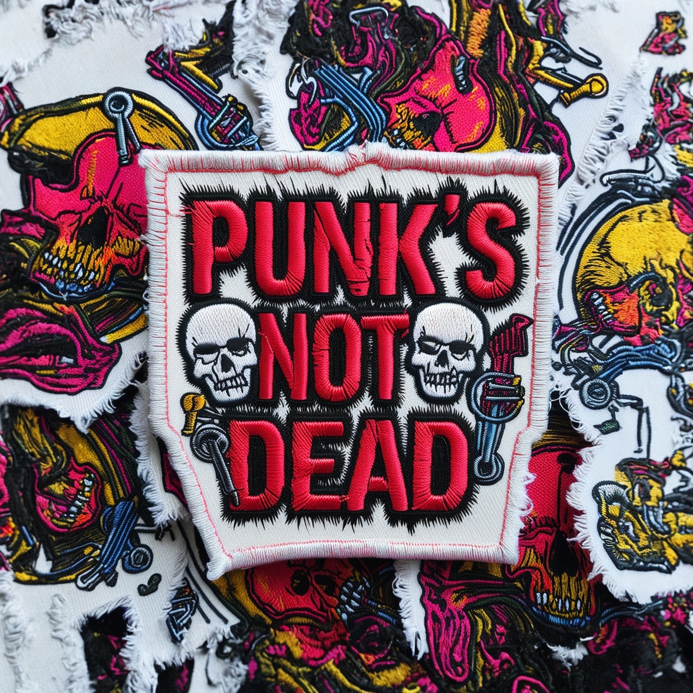
Shape Matters: Think Beyond the Circle
Most patches you’ll see are circular or rectangular, and for good reason—these shapes are easy to produce and look clean when sewn onto jackets or bags. But when designing distinctive patches, it’s worth considering shapes that represent your club’s personality.
The shape of your patch can communicate a lot without saying a word. A triangular patch, for example, might suggest stability and structure, making it a good choice for academic or leadership-oriented clubs. A shield-shaped patch could evoke feelings of protection and defense, perfect for a debate team or security organization. More abstract shapes, like stars or diamonds, can convey creativity and individuality, making them ideal for artistic clubs.
Let’s take a practical example. Imagine you’re designing a patch for your school’s hiking club. Instead of opting for a standard circular patch, you might consider a mountain-shaped patch, with jagged edges representing peaks. The unique shape instantly tells people what your club is about without needing a lot of extra detail.
However, practicality still matters. While a unique shape can make your patch more distinctive, it’s important to ensure that it will be easy to produce and apply. Complicated shapes with too many angles or details might not translate well to embroidery. Work with your manufacturer to ensure that the shape of your patch is both functional and visually appealing.
Typography: Choosing the Right Font
Just like color and shape, the font you choose for your patch can speak volumes about your club’s identity. Fonts have personalities of their own, and they can make or break a design. The wrong font choice can make a patch feel cluttered or difficult to read, while the right font can add clarity and personality.
When thinking about fonts, consider these general guidelines:
- Serif fonts: These are fonts that have little lines or “feet” at the ends of the letters. They tend to feel more traditional and authoritative. If your club is more formal or academic, such as a History Club or Debate Team, serif fonts like Times New Roman or Georgia might be a good fit.
- Sans-serif fonts: These fonts don’t have the little feet on the ends of the letters, which gives them a cleaner and more modern look. They’re perfect for clubs that are forward-thinking or casual, like tech clubs or creative organizations. Fonts like Arial or Helvetica are classic choices.
- Script fonts: These are fonts that mimic handwriting. They’re often used to convey elegance or creativity. However, be careful with script fonts, as they can be hard to read if overused. These might work well for an arts club or theater group, but make sure they remain legible.
Take the example of a school’s Robotics Club. A blocky, futuristic font might give the patch a more technological and modern feel, aligning with the club’s activities. In contrast, a Literary Club might opt for a more elegant and classic font to reflect its focus on the written word.
Once you’ve chosen your font, pay attention to the size and placement of your text. The name of your club should be easy to read from a distance, but it shouldn’t overwhelm the design. A good rule of thumb is to keep the text clear and concise. If your patch has a slogan or motto, consider placing it below the main text in a smaller font, so it doesn’t compete for attention.
Incorporating Symbols and Icons
Symbols are often the centerpiece of a patch design. A well-chosen icon or symbol can immediately tell someone what your club is all about. Whether it’s a sports team, academic group, or artistic club, the iconography you use will play a big role in how your patch is perceived.
Here are a few tips for selecting the right symbols:
- Simplicity is key: Remember, patches are often small, and overly intricate symbols can get lost when scaled down. Stick with clean, simple imagery that’s easy to recognize.
- Use universal symbols: Think about symbols that are universally understood. For instance, a basketball for a sports team or a book for a literature club. These symbols are quickly recognizable and get your message across with minimal explanation.
- Consider abstract symbols: If you want to be more creative, consider using abstract symbols that convey your club’s values without being too literal. A lightning bolt, for instance, could symbolize speed, power, or creativity. A sun might represent energy, hope, or new beginnings.
A great example would be a Chess Club. While the obvious choice might be to use a chessboard or a knight, you could take it a step further by incorporating an abstract design of intersecting lines that mimic a chessboard but are stylized for a modern, sleek look.
If your club already has a logo or a mascot, you should definitely consider using it on your patch. However, don’t be afraid to adapt it or stylize it for the patch to give it a fresh, distinctive look.
Striking the Right Balance Between Simplicity and Detail
When designing a patch, it’s easy to get carried away. You want it to be unique, colorful, and filled with symbols that represent your organization. However, there’s an art to balancing simplicity with detail.
One common mistake in patch design is trying to include too many elements. The more symbols, colors, and text you cram into your patch, the harder it becomes for anyone to process the information. Remember, patches are often viewed from a distance. A design that’s too busy will lose its impact and may look messy or confusing.
To strike the right balance, ask yourself:
- What is the core message I want this patch to convey? Keep that message in mind as you make design decisions.
- What elements are absolutely essential? Eliminate anything that isn’t necessary. Sometimes, less is more.
- How will the patch look when worn? Consider the context in which the patch will be used. If it’s going on a jacket or a bag, how will it stand out among other patches? Test different versions of your design to see how it looks from different angles and distances.
One strategy for ensuring simplicity is to limit your design to three main elements: the club name, a central icon, and one or two colors. By sticking to this rule of three, you can keep your patch clean and focused while still incorporating meaningful design elements.
Incorporating School Branding: Stay Unique, But Connected
While your patch is a symbol of your club, it’s also important to keep in mind the larger context of your school’s branding. Many schools have official colors, logos, or mascots that you might want to integrate into your patch design. Doing so can help tie your club to the broader school identity and create a sense of unity among different organizations.
However, while it’s great to pay homage to your school’s branding, you also want your patch to stand out. The key is to strike a balance between incorporating school elements and maintaining your club’s individuality.
For example, if your school’s mascot is a tiger and its colors are blue and white, you might consider using a stylized tiger in your patch but adding a unique twist, such as incorporating a different pose or expression. Similarly, you could use the school’s colors as a secondary palette while allowing your club’s personality to shine through with a unique icon or motto.
The goal is to make sure that while your patch feels connected to the school, it doesn’t get lost among all the other club patches that may also be using similar colors or symbols.
Testing and Feedback: Getting It Just Right
After you’ve developed your patch design, it’s crucial to test it out and gather feedback. While the design may look great on your computer screen, patches are physical objects that will be worn and seen from various distances.
Start by printing out your design in different sizes to see how it holds up. Ask your club members for feedback: Is the design easy to recognize? Are the colors and symbols clear? Does the patch stand out from a distance?
It’s also a good idea to consult with the patch manufacturer at this stage. Different embroidery techniques can affect the way a design looks in real life. For instance, small details might not translate well to fabric, or certain colors may look different when stitched. Ask for a sample patch before committing to a full order to ensure that your design looks just as good in fabric as it does on paper.
Finally, consider how your patch will be used. Will it be sewn onto jackets, hats, or bags? Make sure the size and shape of your patch are appropriate for the items it will be attached to. A patch that’s too large might look awkward on a small jacket, while a patch that’s too small could get lost on a larger item.
Finding the Right Manufacturer
Once you’ve finalized your design, the next step is finding the right manufacturer to bring your patch to life. There are many factors to consider when choosing a manufacturer, from quality to pricing.
Here are some questions to ask potential manufacturers:
- Customization options: Does the manufacturer offer the types of threads, fabrics, and stitching styles you need for your design? Make sure they can handle any special requirements, such as unique shapes or intricate embroidery.
- Minimum order quantities: Some manufacturers have minimum order requirements, which can be a challenge if you’re only looking for a small batch of patches. Make sure to check what the minimum order is before committing.
- Pricing: Patches can range in price depending on factors like size, complexity, and the number of colors used. Get quotes from several manufacturers to find the best deal that fits your budget.
- Production time: How long will it take to produce the patches? Make sure to factor in production time if you’re working with a deadline, such as a club event or fair.
- Sample options: Always ask for a sample before placing a large order. This will give you a chance to see how your design looks in real life and make any necessary adjustments before committing to a full production run.
Show Off Your Patch: The Finishing Touch
After your patches have been produced, it’s time to show them off! Distribute them to your club members, and encourage everyone to wear them proudly. Whether it’s sewn onto jackets, backpacks, or hats, your patch will serve as a lasting symbol of your organization.
Patches also make great giveaways for recruiting new members. Hand them out during school fairs or club events to create buzz and draw attention to your organization. A well-designed patch can be a powerful marketing tool, helping you stand out from the crowd and leave a lasting impression on potential recruits.
Crafting Distinctive Patches that Stand Out
Designing a patch for your school organization is both an art and a science. By understanding your club’s identity, choosing colors and symbols that represent your values, and keeping the design simple yet meaningful, you can create a patch that is truly distinctive.
Patches are more than just decorations—they’re symbols of belonging, pride, and identity. The next time someone sees your club’s patch, they’ll know exactly what your organization stands for, and most importantly, they’ll remember it.
If you are interested in ordering some high-quality custom patches, feel free to call us at 877-912-6407 or fill out a FREE quote here.